
Creating a new DTC luxury product
BBC CO.
The Challenge
Design a new luxury candle line for novelty candle company Bear Bottom Candles in 11 days for an upcoming trade show. After the trade show, they'd need a new e-commerce website.
Where we started
The original site built in Wordpress but with a free theme, and no product photography on home page, and sales were done via Shoplocket. The owners had lost the password to log in to change the theme, and due to some staff changes in the organization I had no choice but to start over.
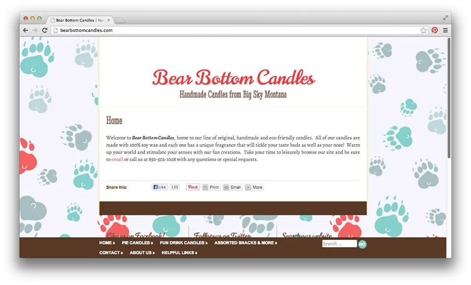
The materials we began with had some problems — photography was not professional, the messages were unclear and the concepts were a little dated. And the novelty food/alcohol candles just were too labor intensive to keep the price point rational and not appealing enough for repeat sales. The advertising did not look professional, and I only had a total of about 6 usable photographs to work with on the web site and in ads for outlets like People Magazine.


This was a typical trade show setup before the redesign.
Solutions
The client wanted a new modern, sleek, simple luxury line, which would need a completely new brand identity of its own. My biggest challenge there was that it needed to be luxurious AND incorporate a "bear-bottom." So how do we do this?
The brand director suggested I do something with the letters BBC — so I jumped on that chance. The new line would become BBC: The Spa Candles, a line of more sophisticated scents and with an emphasis on simple, accessible modern luxury. It checked all our boxes.

I took cues from nature like wood grain, cork and sand, and incorporated soothing, muted colors and neutrals.
The client still had a large supply of unused barware from the novelty brand, so I repurposed an old-fashioned glass for the full sized candle and a shotglass for the votive.
Color family and sketches for the product concept.
The simplicity of the new design only took one pour per candle. They were fast and easy to make, increasing ROI.

I framed the photography for the web graphics with elements from nature and the same neutral colors. I also wrote the copy in a way to place an emphasis on the type design and work with sliders if the client chose to use them.
Typeface: Gotham
For packaging, we needed a very quick makeshift solution because the trade shows were coming up within DAYS, so we ordered plain white high wall boxes and finished them with a simple ribbon. I designed wax seals with the logo to seal the ribbon with. The result was simple, elegant, and classic, which was reflected in comments on their Facebook fan page.

Interim packaging — clean white high wall boxes, coordinating ribbon by scent label and wax seal.
The trade show setups also got a new look.
Pics from the new trade shows and signage. Facebook fans commented on liking the "classy new look."
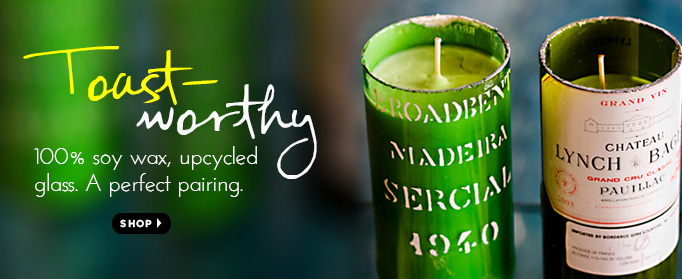
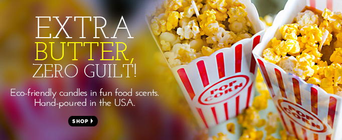
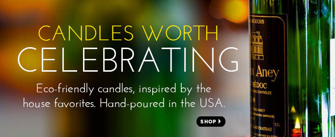
Once the trade shows were over, I had to take on the task of creating the new web site that incorporated both the food and drink candles along with the Spa Collection. I integrated the 6 usable pics off the first site as dominant sliders for art, and built-in e-commerce. It was also mobile responsive.
The new web site featured product photography prominently and made products the focus of the site, and had integrated e-commerce for shopping directly off the site. *Note: The web site is now under different creative direction.
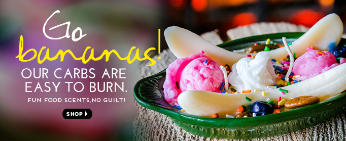
I wrote fun sliders with the 6 good images that retained the "whimsy" of the original concept but in a professional-looking way, since they were still selling the food and drink candles along with the Spa Collection. I also programmed the sliders with Revolution Slider on Wordpress and wrote the custom CSS.
Advertising also got a revamp. These were print ads featured in People and bridal magazines. I wrote the copy, sourced the photography and designed the ads.