Visual Storytelling & Communication Design
Business Communication
The Challenge
Designing engaging internal communications for the largest wine and spirits distributor in the U.S. is more challenging than it seems. Despite the fun industry, the content is often dry and complex, filled with dense legal jargon. Turning financial concepts like vesting into liquor-related metaphors was the kind of challenge I enjoy.
Let's take a look at some examples:
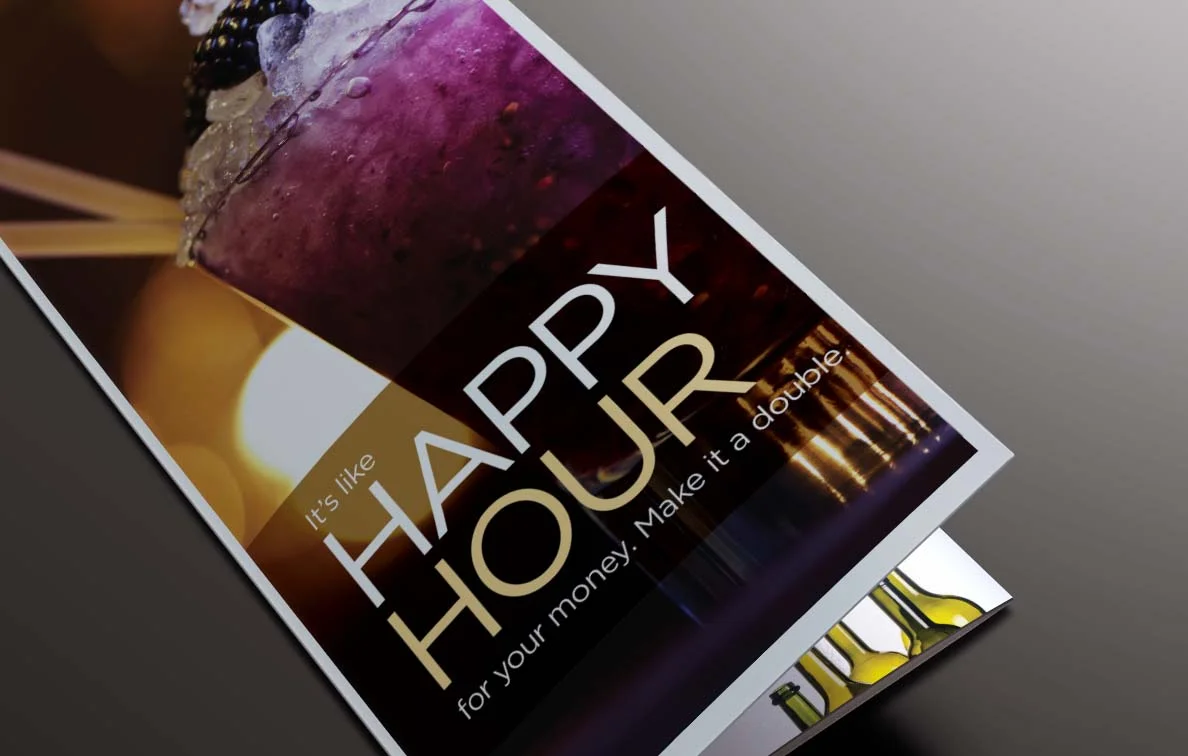
Cover for a series of mailers about smart investing.

Inside spread of one mailer, explaining how your money grows over time with your 401(k).

Inside spread of another mailer, visually explaining how vesting works.
So, do you know what an SPD is?
If you work in corporate America, you've probably received one every year but never read it because it's so boring. This client, however, went the extra mile to help employees understand their benefits. I had the honor of designing the coolest SPD in history—complete with an art budget and color printing. That's a real luxury in SPD design!

SPD cover
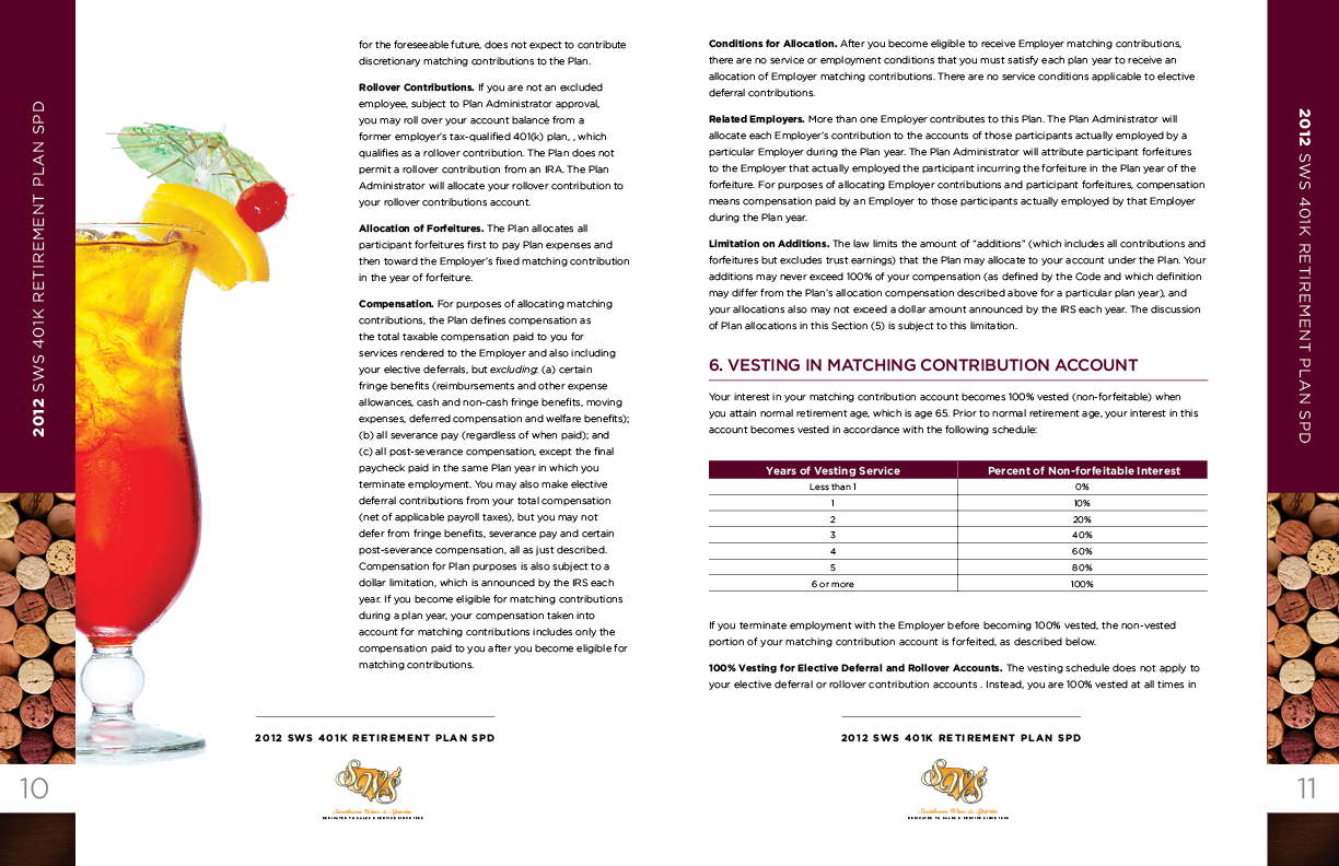
SPD inside spreads.