Rebrand & Redesign
THE TJP
The Challenge
I was brought on board at the Texas Jewish Post to give the publication a new look. The paper was family-owned and launched in 1947 — so it predated Israel. While the publication had a solid readership, they wanted to attract and retain younger readers, which was a challenge because that meant bridging a gap between readers over 70 years old and readers in their early 30s. The print, advertising and online products all needed some revamping. Here's what we did:

The original look was pretty average as far as community newspapers go, but the publisher had just inherited ownership of the paper and wanted to give it a real "presence."
The TJP Guide to Jewish Living was the large annual project — it was a 72 page directory of listings of Jewish businesses and organizations. The Guide was also well-used by readers but again, the publisher was looking for a completely new look.
The old web site was run and maintained by a service that specialized in newspaper web sites, but it wasn't terribly functional — online advertising was hard — we didn't have a lot of control over the look, and it looked dated. The email section still had an animated mailbox .gif, and the in-house Click and Subscribe ads also needed an update.

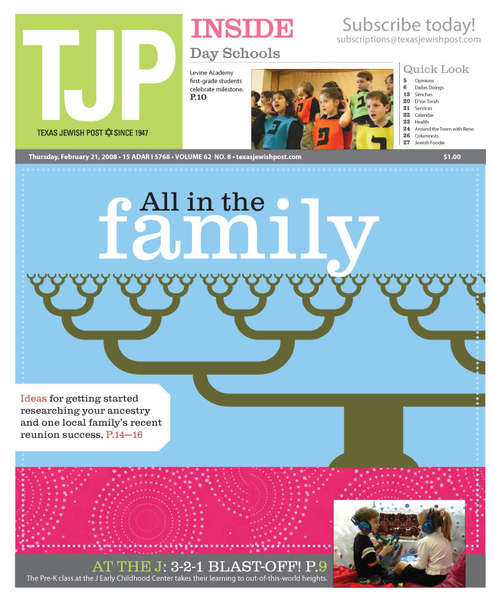
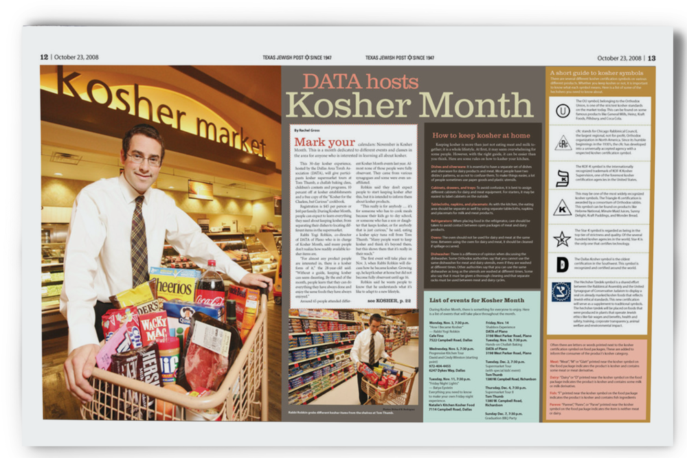
The flag was changed to read "TJP" instead of "Texas Jewish Post" for greater impact. I began to treat the cover as a true "cover," meaning that no stories began on it. This was a HUGE time-saver for production, since the cover could be treated independently instead of waiting on 3 to 4 stories to come in later on deadline. We also started using either custom illustration, stylized graphics, or professional photography for cover art. This made a huge difference in how the publication was viewed by local business. It was taken more seriously, and that change was reflected in advertising sales.
While the Guide was already well-used, I wanted to make it more of a coffee-table piece, something people would leave laying about because it was pleasant to look at and use, rather than tucking it away. I did the custom illustration the years I was there. There was a lack of hip, modern Jewish art on stock art sites and in general online, so this gave the TJP a very unique, distinctive look.
I redesigned the web site in Wordpress, which gave us more control over it. I modified the .php files and framework to support more online advertising, which was huge because we didn't have that revenue stream available before.
The New Guide to Jewish Living
Before The old annual listings publication for the Texas Jewish Post (TJP), a collection of contacts and information about Jewish business city-wide.

After My goal was to make these something pleasant enough to keep on a coffee table using custom illustration. This was essentially a listings/telephone book, and it DID get used in households, but people didn't feel that they were "special." But there was very little "hip" Jewish art on the market, and people looked forward to getting the new editions every year post-redesign.


Redesigned weekly publication